
I recently had a reader reach out to me with a request:
I notice that the search bar on your website is positioned way down the website when I view it in portrait mode in Safari on my iPad mini. I can see it on the right side of the screen when I view your website in landscape mode. Is it possible to configure your website so that the search bar is in a central position near the top of your website? I guess this may prevent the search bar from being moved when I view it in portrait mode. Thanks.
The reason for this is that the search bar is inserted in the right sidebar of the website. On desktop that means it’s displayed fairly high up the page while scrolling down, but on mobile everything in the sidebar is positioned below the main content of the site.
It had never occurred to me that this would be an issue for someone wanting to search the site on mobile because I always use the search functionality on the backend of the site whenever I need to find a post – something readers don’t have access to.
I’m glad Ben asked about this because there’s a good chance that if it makes his life harder, it makes life harder for other readers too. I’ve now added a plugin which has allowed me to add a search bar to the main menu which can be easily accessed on both desktop and mobile.
On desktop, you can see it on the far right of the menu at the top of the page – just click on the magnifying glass and enter your search term:

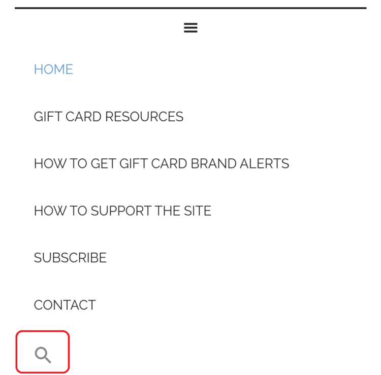
On mobile, click the menu icon (the three horizontal lines that look like a hamburger). This’ll show a dropdown list which has the magnifying glass listed at the bottom. Simply tap on that and you can do your search on mobile without having to scroll to the bottom of the website to access the other search bar.
I hope this helps 🙂